Booklicious: October 2012

October 29, 2012

| 0 comments]

I'm a big fan of home-design projects — in our apartment, Michael and I can point to a coffee table, bed frame, headboard, bedroom chest, and glass-ball chandelier as pieces that we designed and built from scratch using our own hands. And I really love walking into a friend's home and recognizing their personality via furnishings, accessories, or styling. So when I came across this headboard of books, I was tickled, because it's exactly the level of book dorkiness I can relate to. It's the creation of Kassandra Utzinger, of blog Design Every Day, who whipped it up for her new apartment. Generously, she's posted step-by-step photos and directions for anyone who wants to construct a bookish headboard of their own. I think this could look stunning with books featuring old illustrations, or multiple copies of the same book but with each turned to the next page so that someone in bed could actually read a section of the book from the top of the headboard to the bottom.

0 comments

Post a Comment

October 24, 2012

| 0 comments]

{This is content that originally ran May 5, 2010. Click here for the original post.}

 
Here's one more reason (as if we needed any more) to love Jimmy Stewart. Not only was he handsome, talented, and adorably goofy, he also had a serious library to boot. Jimmy Stewart and his wife, Gloria, lived in this Beverly Hills house for nearly 50 years (!), and it's been kept up by the Stewart family since Jimmy's death in 1997. "The library was the most used room in the house," said his daughter Kelly. "Family and friends always gathered there before dinner." 

Sigh.

You can browse more photos of the house at Architectural Digest's site.

0 comments

Post a Comment

October 23, 2012

| 1 comments]

{This is content that originally ran March 11, 2010. Click here for the original post.}

This video is a fascinating look at what goes into the making of a book cover, and the best part is seeing the six hours of designing fly by in two minutes.


 Lauren Panepinto, creative director for Orbit Books, is the woman in front of that screen. Read about her process here.

1 comments

Post a Comment

October 22, 2012

| 0 comments]

{This is content that originally ran January 18, 2011. Click here for the original post.}

 
[Clockwise from center: 1010 classic pen $19,000; bookcase; industrial gear bookends $69; octopus illustration on dictionary $9.99; camera bookend $99; Steampunk Tales e-magazine $1.99; bookplates $15.75; bookmark $55]

[Typewriter key arm guard by Amanda Scrivener]

[Table lamp by Frank Buchwald]

[The Ferryman reading and research lamp]

0 comments

Post a Comment

October 19, 2012

| 0 comments]

{This is content that originally ran April 13, 2010. Click here for the original post.}

This decorating look from Ruche is somewhat akin to the book wallpaper I wrote about a few weeks ago, but instead of papering walls with images of books, this project uses loose pages (preferably from already decrepit books). 

It's a fun DIY project that actually sounds pretty manageable, even for us un-Marthas. Basically, you take some liquid starch, roll it onto a wall, cover with the pages, then re-roll starch over the top. Piece of cake. To create the "floating" stacks of books, the poster suggests attaching l-brackets to a book and stacking more on top, but that seems a bit brutal to me. A book-friendlier way to do it would be to use this Conceal shelf from Umbra. But I don't think the books are even necessary - it's the layering that's pretty. Although, if I were to do it myself, I'd probably paste down the corners of the pages for a sleeker effect.

0 comments

Post a Comment

October 18, 2012

| 0 comments]

{This is content that originally ran January 19, 2010. Click here for the original post.}

I recently discovered Curious Expedition's compendium of beautiful libraries and Oddee's 20 of the world's most beautiful libraries — now that's some fantastic reading. I've sifted through their lists and come up with my favorite 15. I didn't include private libraries—I'll do a separate post dedicated to those in the future.

[Abbey Library of St. Gallen, Switzerland]


[Austrian National Library, Vienna]


[Admont Monastery library, Austria]


[Reading room at the British Museum, London]


[Klementium Library, Prague]


[Bad Schussienreid Library, Germany]


[Melk Monastery library, Melk, Austria]


[George Peabody Library, Baltimore, Maryland]


[Real Gabinete Portugues de Leitura, Rio de Janiero]


[Biblioteca Nazionale Marciana, Venice]


[Library at Strahov Monastery, Prague]


[Trinity College Library, Dublin]


[Wadsassen Abbey library, Bavaria, Germany]


[Wiblingen Monastery library, Ulm, Germany]


[Biblioteca Geral of the University of Coimbra, Portugal]

0 comments

Post a Comment

October 17, 2012

| 0 comments]

{This is content that originally ran December 23, 2009. Click here for the original post.}

This may be the coolest map of the United States I've ever seen. Who says geography is boring?

0 comments

Post a Comment

| 0 comments]

Guess who's going on vacation?! To keep the Booklicious fires burning, I've rounded up a few golden oldie posts and will roll them out through the week. See you all next week!

0 comments

Post a Comment

October 16, 2012

| 1 comments]

Instead of carving the same old jack o' lantern this year, take things in a nerdier direction this time. Here's a roundup of lit-inspired pumpkin carvings to kickstart the creative process. 


Poe (faux pumpkin, but still amazing)


1 comments

Post a Comment

October 01, 2012

| 1 comments]

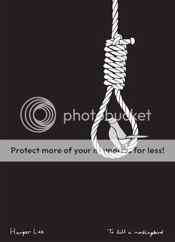
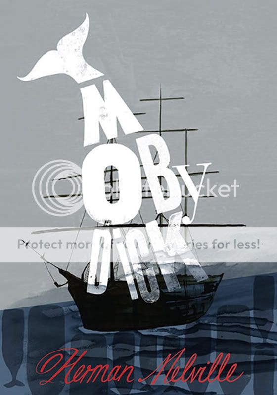
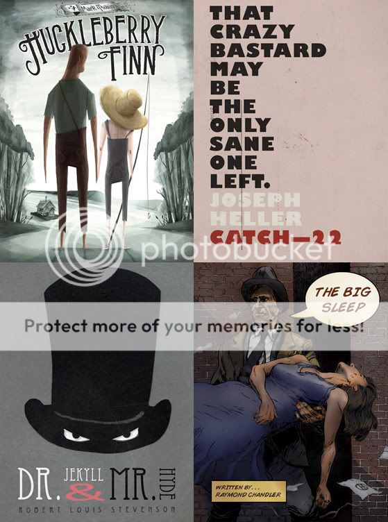
In 2003, Robert McCrum of the Observer compiled a list of the 100 greatest novels of all time. This year, to celebrate the list and raise awareness of illiteracy, Belgian design firm Beshart commissioned 100 artists to redesign the covers of those novels in poster form, unveiling them on International Literacy Day (Sept. 8). I've included some of my favorites below, along with each artist's reason for selecting their particular novel; you can view the rest — and purchase them if you wish — here

In light of the renewed interest in his list, McCrum reflected on his work this past weekend. 


    TO KILL A MOCKINGBIRD, DESIGNED BY PAUL BOARDMAN:
    “I chose this title because it is one of my favourite books, really. I think it approaches very serious subject matters with a remarkable lightness of touch — with characters that are instantly memorable.”


    AS I LAY DYING, DESIGNED BY EMMA COOK
     “The continual tragedy from one character to the next drew me to the book. The story is quite tragicomic in the ridiculous amount of misfortune that befalls the different family members. I have a love for dark stories.”


     DON QUIXOTE, DESIGNED BY LOBULO DESIGN
     “Don Quijote is without doubt the most important book in Spain. I remember making different works about this book as a kid in school, maybe this is the reason why I chose it. I created the three stages in the life of Quixote: knight, mad and finally dead. This cover is created by tiling creating different triangle structures made out of paper.”


     MOBY DICK, DESIGNED BY SHELLEY REVILL
    “I read Moby Dick a couple of years ago and loved the depictions of life on a whaling ship. It is very visceral and dramatic. A time and lifestyle far removed from me. It is a layered book with lots of symbolism, with themes of obsession, religion, mortality, might and progress. I was inspired by the whaling log books I saw scans of online, with their beautiful calligraphy and the whale stamps that they used to depict their haul (you can see my reference to that in the sea in my image). Moby Dick and his perceived evil barbarism is in fact entirely projected by the Captain Ahab. A creation of mind and word and since Moby Dick is also a rare albino whale he is shown in my image with bright white lettering. It is a complex and rewarding story of adventure. Well worth a read!”


    FRANKENSTEIN, DESIGNED BY SIMON EVERAERT
    “I didn’t choose the Frankenstein cover, but the Frankenstein chose me! I accepted this challenge with open arms and tried to give it a twist so it puts a smile on your face while it’s a tragic story...”


     L.A. CONFIDENTIAL, DESIGNED BY LIAM BUSHBY
     “I chose this book as I spent some time in LA last year. There is a really strange and unique feel to the place and having not read a lot of the other books, it definitely felt this one would be a good fit.” “What I’ve done with the cover: When it came to an idea for the cover, it didn’t take too much thought. I explored a few ideas but this felt the simplest and strongest as a cover. I also didn’t want it to be too cryptic or indulgent, as it quite easily could have become. I liked the mix of a big visual and small title, and also the way I could incorporate a brief synopsis of the story line seamlessly into the design.”


    CLARISSA, DESIGNED BY CRISTIAN G. CASTELLON
    "The creativity and technique of two disciplines as diverse as hairdressing and graphic design merge together in projects where the raw material is colour, hair, cardboard and an optimistic vision of the world.” 


     ALICE'S ADVENTURES IN WONDERLAND, DESIGNED BY TIM VAN DEN BROECK
     “Alice’s Adventures in Wonderland is a story that carries me away from the daily worries to a place of wonder and wisdom. It triggers my imagination, makes me smile and teaches me a great deal about myself and life in general. The illustration is drawn with graphite pencils. I wanted to pay tribute to the black and white illustrations by Sir John Tenniel in the original book and I also took the opportunity to experiment with a technique that is different from my usual, more digital work.”

1 comments

Post a Comment

 
{"retval":1,"msg":"","data":